All works
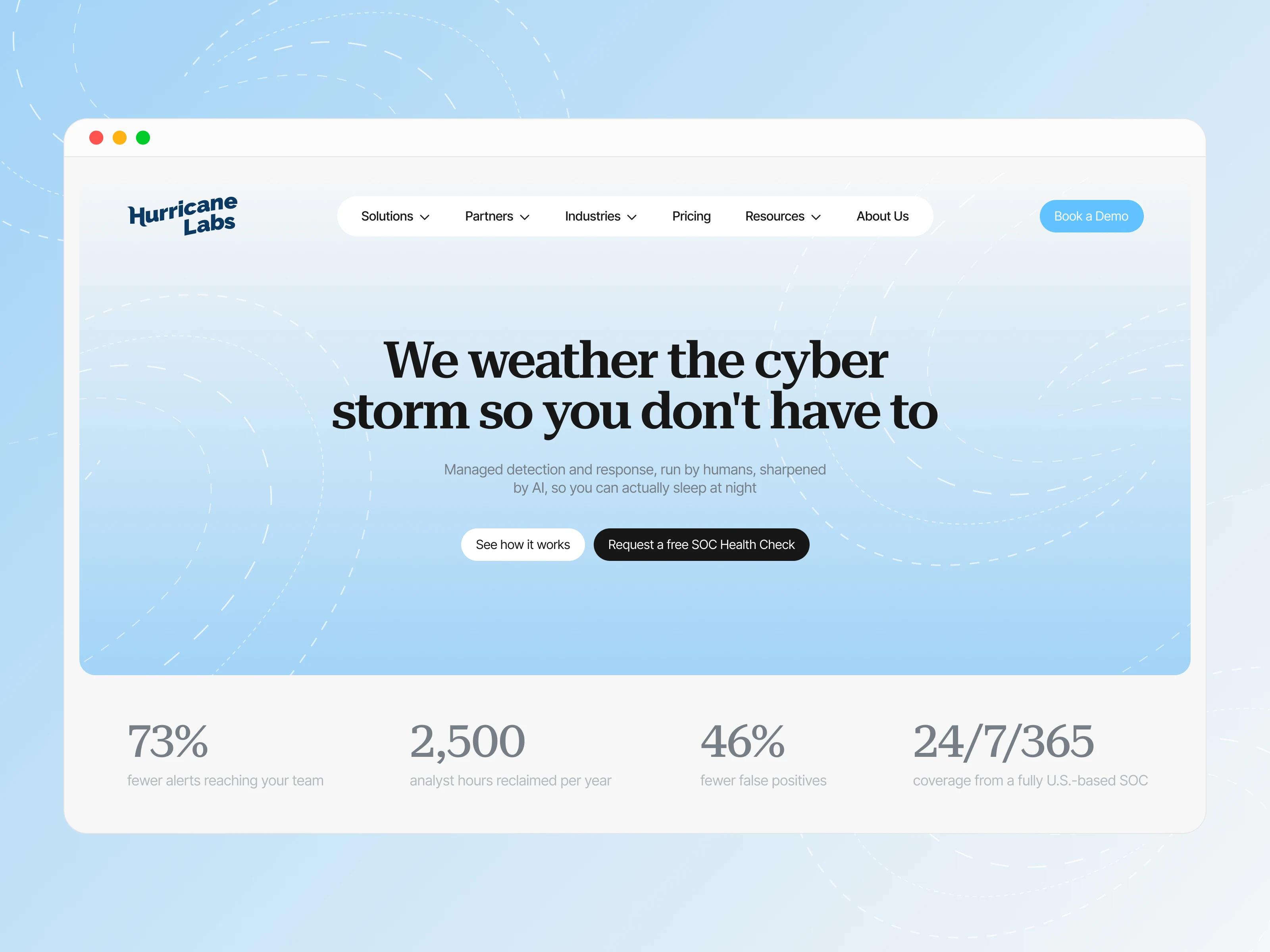
Hurricane Labs came to me with a fairly clear understanding of what they didn’t want to be. In cybersecurity, most websites speak the same visual language: dark interfaces, a constant sense of threat, complex technical imagery, and impersonal technology. Hurricane Labs wanted something different — to feel calmer, more human, and easier to understand, without losing credibility with an enterprise audience.
The client had already defined the core direction of the brand positioning, and my role was to develop it further and turn it into a complete digital system. I had enough freedom to work not only on the visual direction, but also on the overall site logic, page structure, and content presentation, making sure the website spoke consistently and supported the right brand character.
Making complex security easy to understand
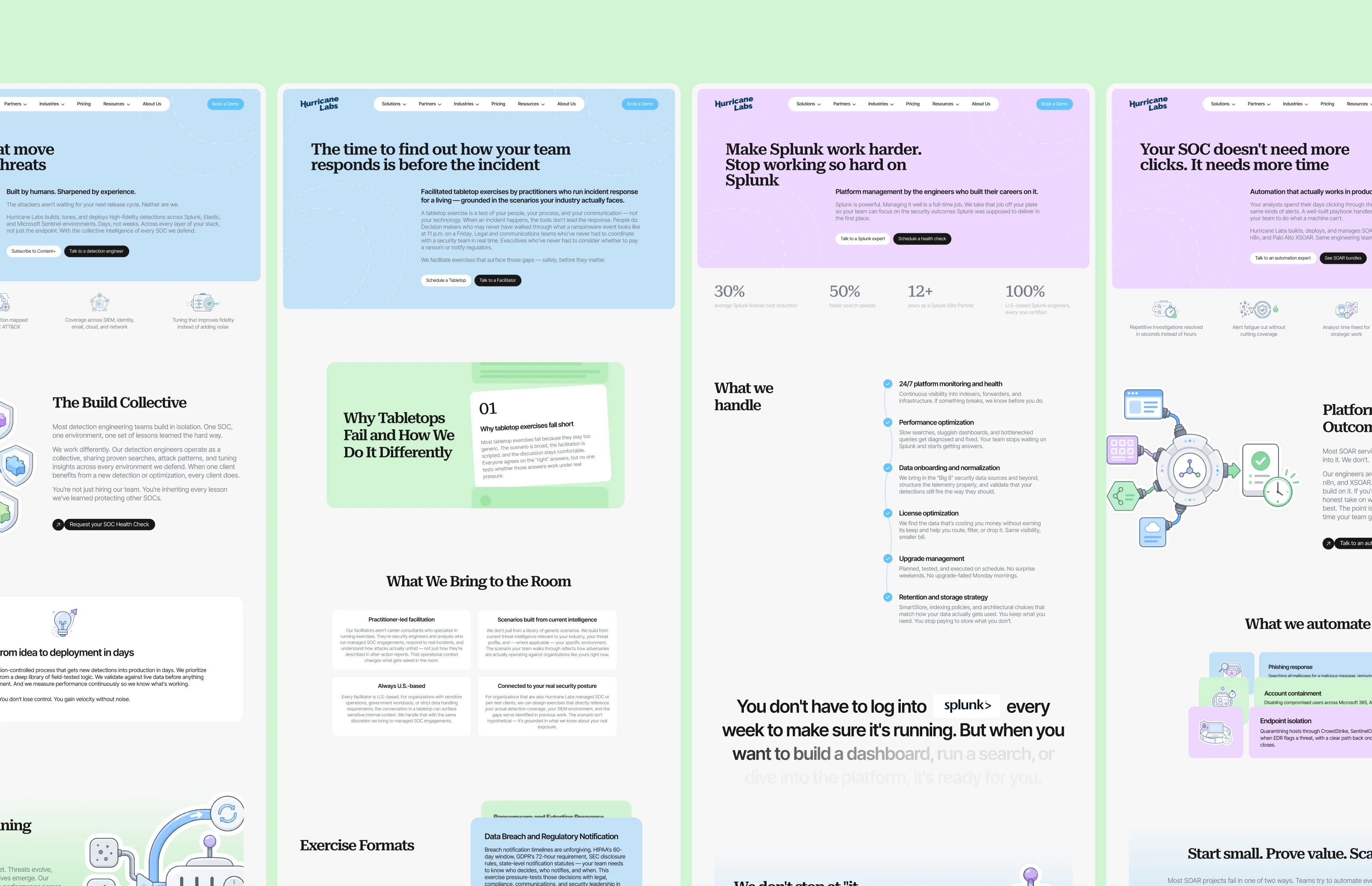
One of the biggest challenges was the sheer volume of technical content. Hurricane Labs offers many services that are closely connected and can seem very similar at first glance. At the same time, the website needed to be easy to understand from the first visit while still providing enough depth for an experienced security audience.
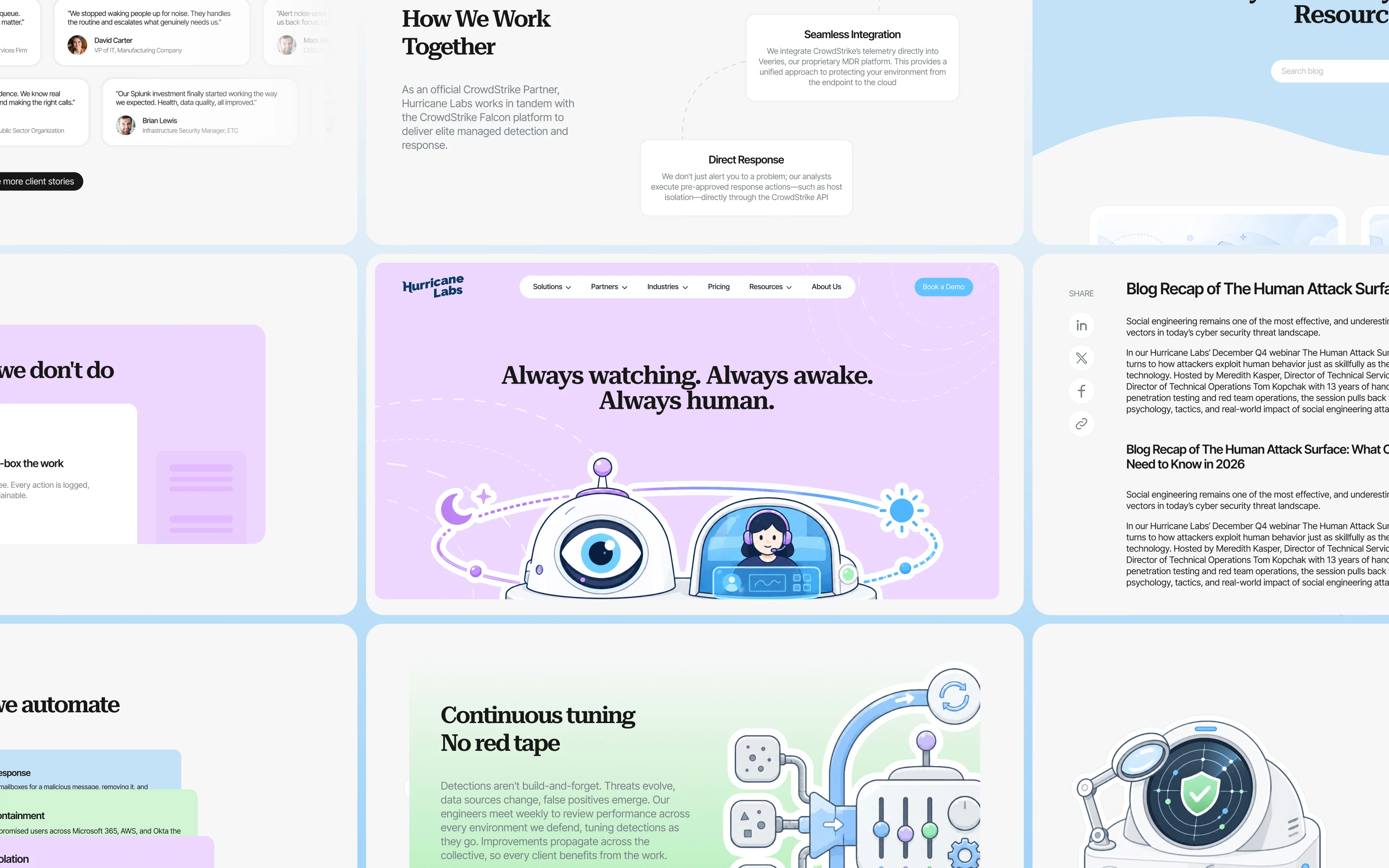
Neither the client nor I wanted the website to become a collection of identical service pages. So each key service received its own structure, rhythm, and visual logic. In total, I designed 15 unique pages, with only three of them serving as templates for larger groups of content. All core service pages were designed individually.
Cybersecurity without the typical cyber look
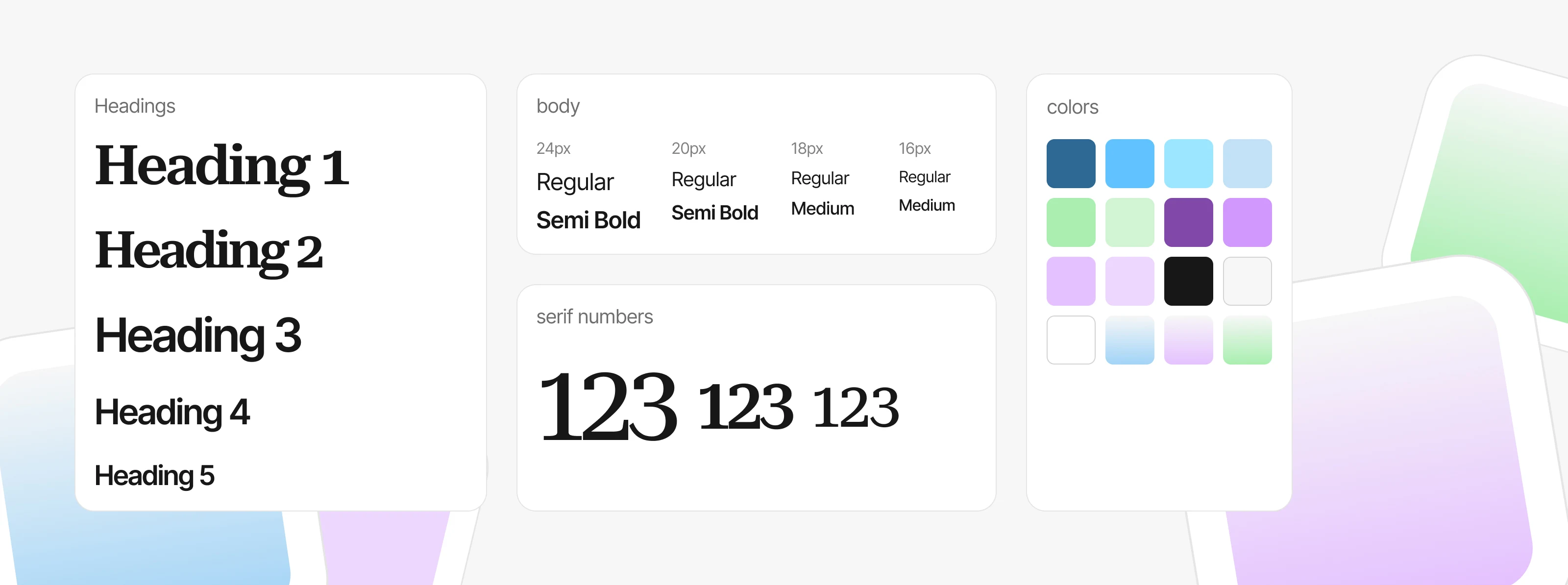
The visual direction started with one simple decision: no dark “hacker” interfaces, endless dashboards, locks, shields, or dramatic threat-driven aesthetics.
Instead, I built a bright, calm visual system around soft blues, lilacs, and greens, generous whitespace, bold typography, and a clean modular grid. It was important to make the brand feel friendly and approachable without losing the credibility of a serious enterprise product.
Visual stories instead of abstract icons
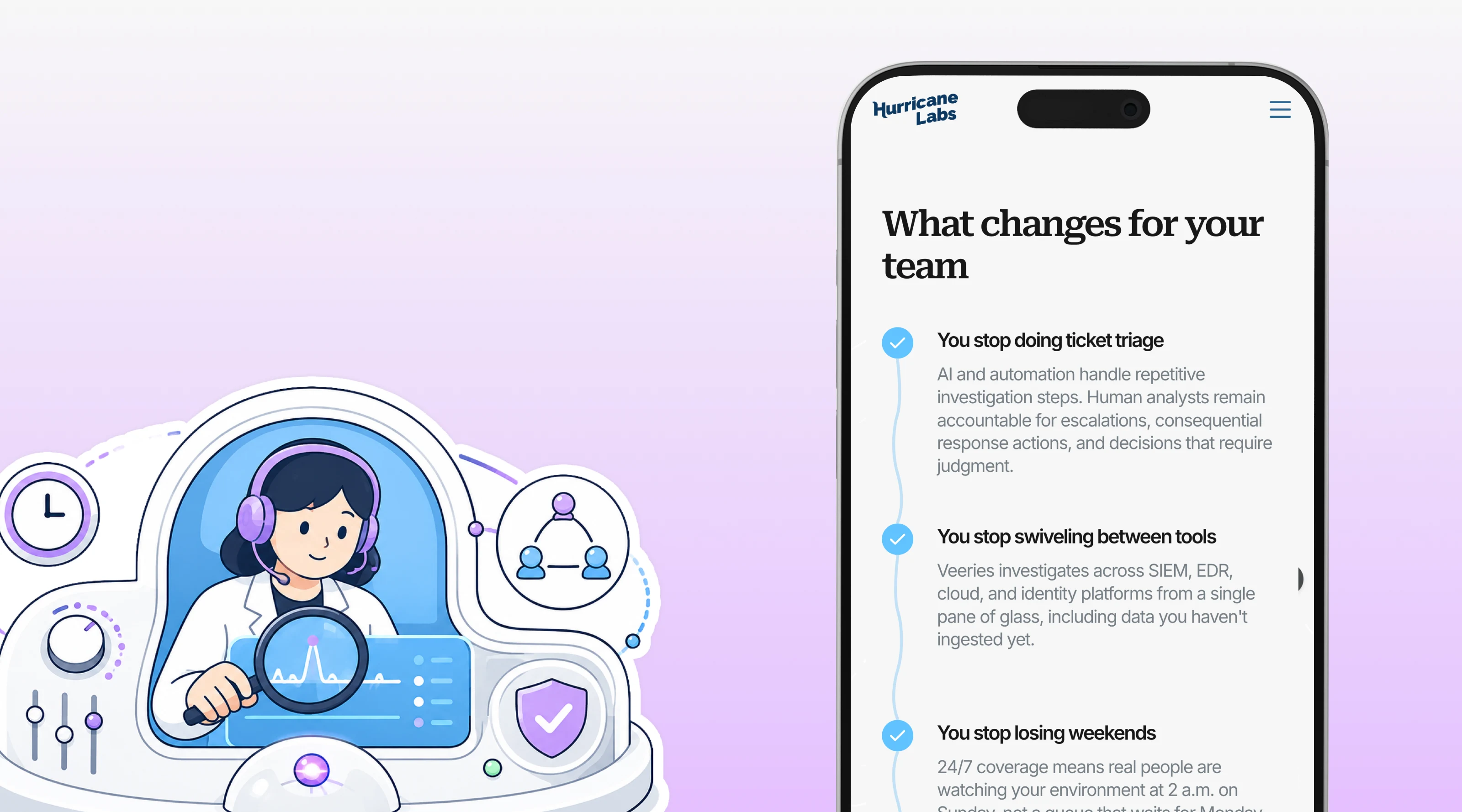
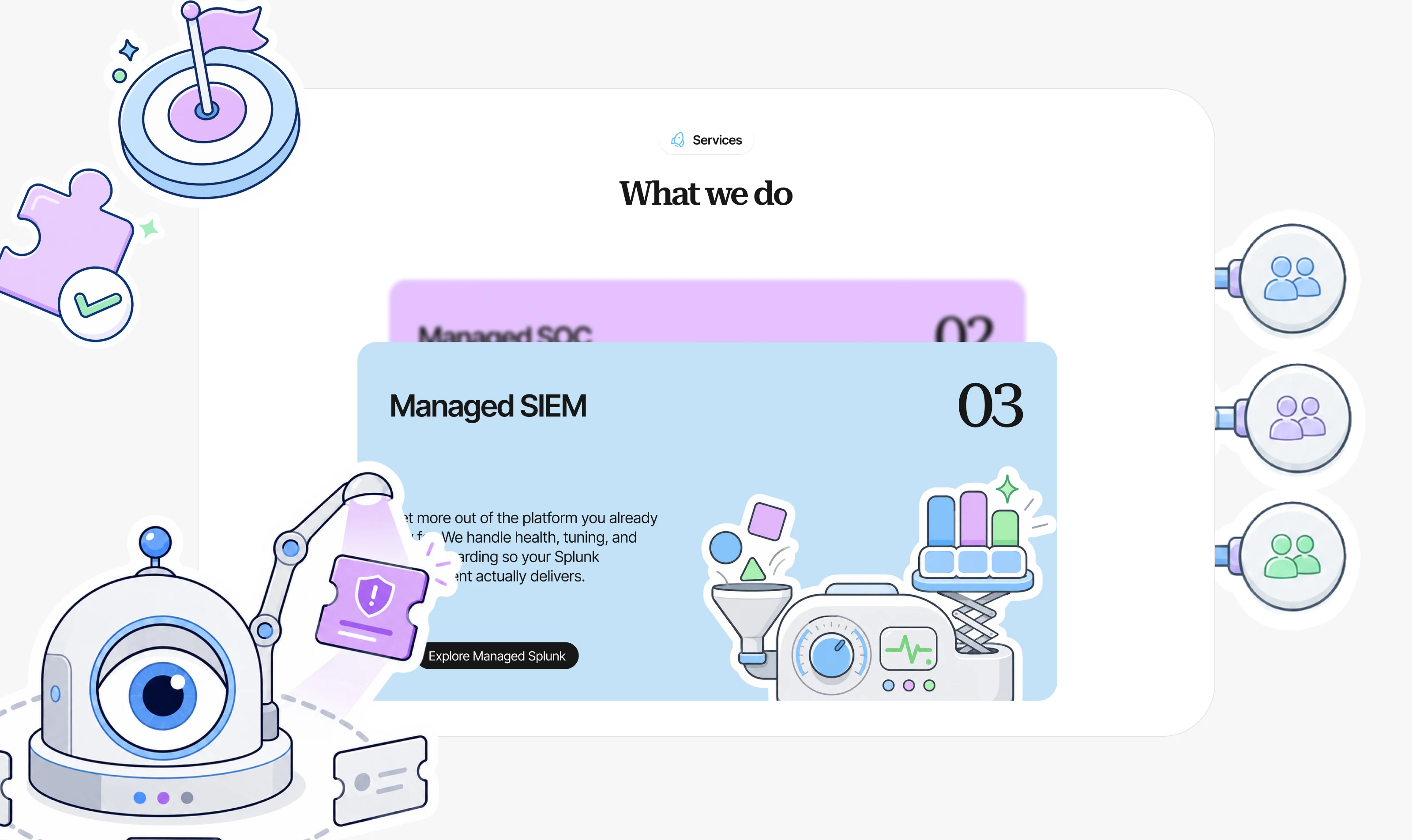
A separate part of the project was the illustration system. Instead of using standard cybersecurity graphics, I developed a custom visual language in which complex topics — monitoring, automation, detection engineering, infrastructure, and incident response — are explained through clearer and more approachable imagery.
I defined the overall style and developed the meaning, composition, and metaphor for each illustration individually. Every image was created from scratch using an AI-assisted workflow and custom prompts, all within one consistent art direction system.
Making pricing easier to understand
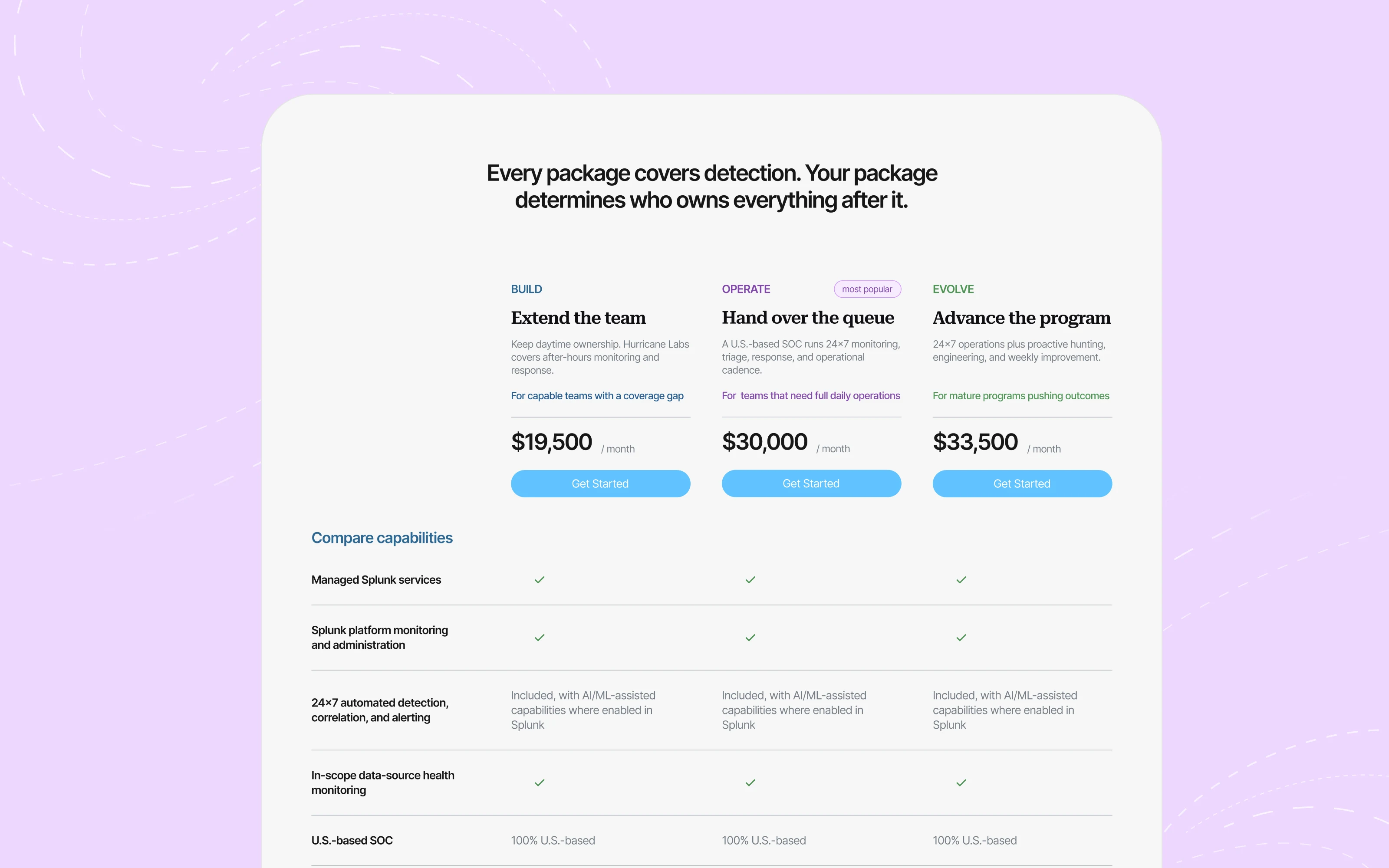
Pricing became one of the most information-heavy parts of the website. Instead of turning it into a long list of plans and features, I structured the experience around different ways of working with Hurricane Labs, helping users understand more quickly which model would best fit their team.
From concept to launch
Throughout the project, I was responsible for the strategic visual direction, structure, content editing, typography, visual style, illustrations, motion, web design, and development.
The result is a cybersecurity website that communicates expertise without relying on pressure or intimidation — technical where it needs to be, and human everywhere else.
“Roman was communicative, efficient, and agile. He was able to adjust our site according to evolving needs, and met deadlines along the way.”